The Stanford School of Earth, Energy & Environmental Sciences is now part of the Stanford Doerr School of Sustainability.
This page is currently being maintained for archival purposes only. For the latest information, please visit us here.

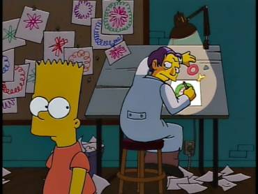
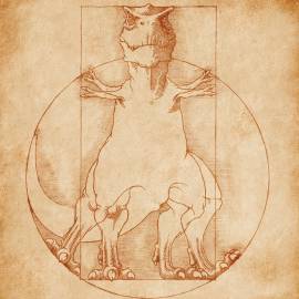
Margot Gerritsen renders stunning visualizations that capture the complex mathematics that describe Earth processes. Bart Simpson and a Renaissance T-Rex stop by to help explain how she does it.
Can mathematics be beautiful?
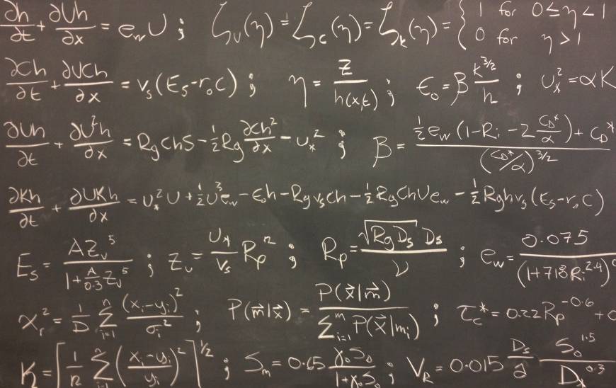
Geoscientists who build and use complex mathematical models lovingly refer to the equations as "Greek alphabet soup."
And in a certain way, the Greek alphabet soup - the rows of squiggly lines that describe the amazing complexity of Earth’s climate, geology, hydrology, and even the Google search you used to find this article - is beautiful. Admittedly, the equations are more beautiful in an abstract sense in that they reveal hidden truths of our universe, rather than a literal sense of framing them and hanging them on your wall.
But then scientists find ways to represent the mathematics that describe various Earth processes like this:
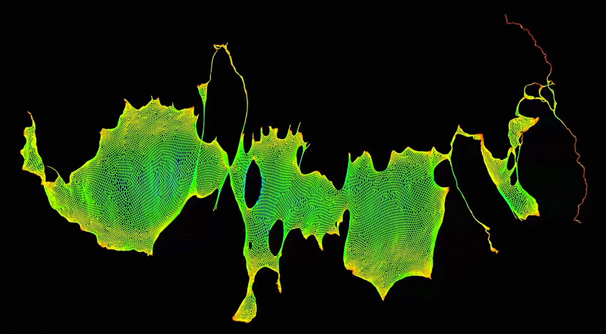
Visualization of a tidal flow model (courtesy of Oliver Fringer, Philip Wolfram).
And like this:
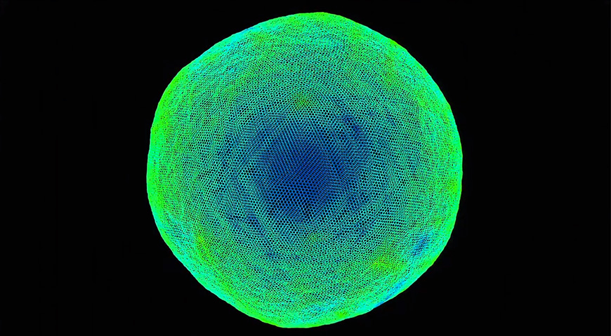
Visualization of a shallow water flow model (courtesy of Tim Davis).
Margot Gerritsen, a mathematician and Earth scientist, creates images like these to help visualize complex mathematical networks, highlighting connections that would be otherwise more difficult to see just staring at the blackboard or a very large file of matrix coefficients. What makes these geometrical and sometimes spirograph-like images all the more impressive is the mathematical method underlying the artistic complexity.
As opposed to the straightforward geometrical madness underlying the dwindling number of spirograph artists.
To understand just how Gerritsen builds the image, we have to climb inside the head of a mathematician for a second. And rather than try to deconstruct a series of equations describing how tides flow into and out of harbors, we’ll tackle something simpler: books.
Imagine that you’re a big fan of Walter Alvarez’s T-Rex and the Crater of Doom, the book describing his scientific work that linked the extinction of the dinosaurs to a meteor impact. Also imagine that you’d like to find more books like this one (in this thought experiment, you’re a geology nerd like myself). Being the clever sort that you are, you try to devise a better way to find related books than Amazon.com’s “If you enjoyed this, then you might like…” method, because seriously, that hardly ever works.
You decide to go through the entire Library of Congress and organize the books based on their subject headings - basically keywords that describe the books’ content - rather than their authors and titles. You begin with T-Rex and the Crater of Doom and find that it’s subject headings include “Earth Science, History of Science and Medicine, and Dinosaurs.” So you set out to find similar books, which means filtering your results so that they aren’t likely to include subject headings like “Renaissance Art.”
Though, the internet is happy to find that link if you really want it (via jameses_x at Threadless).
You begin the visualization based on the subject headings, all of which have relationships with each other. If the subjects and subcategories are strongly correlated, then they will appear closer together on the image. If they are not well correlated, then they remain farther apart. As you have probably guessed, this thought experiment is precisely what Gerritsen and her colleagues did when they created a stunning visualization of the subject headings for every book in the Library of Congress. The resulting image resembles the delicate beauty of some faraway galaxy.
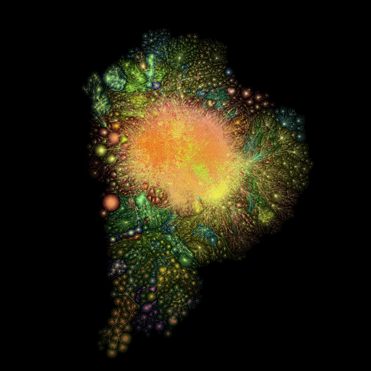
No, this isn't an actual, star-filled galaxy. It's "The Galaxy Plot" of the Library of Congress' Subject Headings (LCSH) (courtesy of Margot Gerritsen).
Each “star” in this galaxy represents a subject heading or sub-heading, and each line represents a connection to another heading or sub-heading. So to find books related to T-Rex and the Crater of Doom, you just need to explore the star cluster closest to “Earth Science, History of Science and Medicine, and Dinosaurs.” The more you explore, the more connections you are likely to find - sort of like browsing Wikipedia.
Returning to the Earth sciences, we can now start to think of the Greek alphabet soup in a similar way to the subject headings. Under the broad heading of “Physics,” we’re likely to find connections to sub-headings such as “Atmospheric Physics, Thunderstorms, Temperature, Humidity, Wind Strength, and Solar Radiation.” We can also imagine the connections between sea water temperature, salinity, and topography that control the strength of tidal currents. All of these connections sit within the equations that describes the physics of these systems. Imagine what those connections might look like when mathematically joined and you get the types of scientific visualizations that bring a smile to Gerritsen’s face.
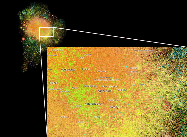
The Earth and natural sciences cluster (courtesy of Margot Gerritsen).
“I was looking at these equations and it was only after speaking to an artist that I could really get them to sing - to represent the excitement I felt when looking at them,” Gerritsen told me.
Gerritsen’s excitement spills over into her students as she uses the new visualizations to help inspire their imaginations and help them engage with matrices, partial differential equations, and other mathematical fields typically not presented in visually.
In using complex mathematical algorithms to visualize likewise complex mathematical models, Gerritsen and her artistically-inclined colleagues are changing the way we see equations. We no longer need to think of models as strings of greek symbols and plus signs, of computer bits translated in ones and zeroes. We can see the models as colored tendrils in elaborate geometrical configurations. We can see their connections as a web of points either densely or sparsely packed.
This is a different way to see mathematics. And it’s beautiful.
Margot Gerritsen is an associate professor of Energy Resources Engineering and, by courtesy, of Mechanical Engineering and of Civil and Environmental Engineering. She is also the Director of the Institute for Computational and Mathematical Engineering.


© Stanford University, Stanford, California 94305. Copyright Complaints